Mastering Color Theory in Graphic Design
Color is a fundamental element of visual communication, influencing perception, mood, and comprehension. For graphic designers, a working knowledge of color theory is essential for creating designs that are not only aesthetically pleasing but also effective in conveying the intended message. This article provides an overview of the key concepts in color theory, including the color wheel, harmony, contrast, and the psychological impact of color choices. By understanding these principles, designers can approach color selection with greater confidence and intentionality.
The principles discussed here are applicable across various design disciplines, from branding and marketing materials to digital interfaces and print media. While individual projects may have specific requirements, a solid foundation in color theory enables designers to make informed decisions that align with the goals of the design and the expectations of the audience. The following sections explore the core components of color theory and how they can be applied in a practical design context.
The Color Wheel: A Foundational Tool
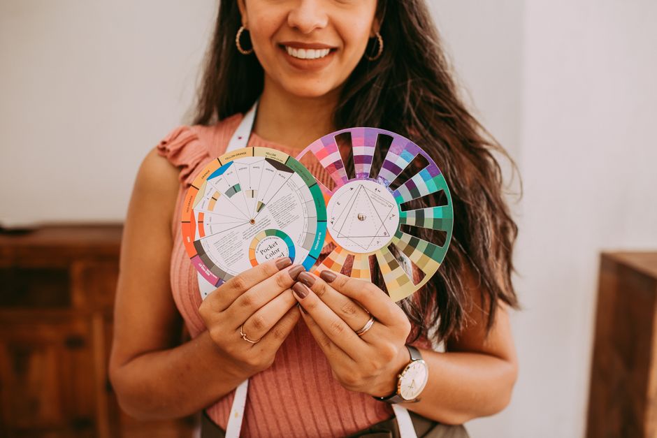
The color wheel is a circular diagram that organizes colors according to their chromatic relationship. It is a fundamental tool for understanding how colors interact and for creating harmonious color schemes. The wheel is typically divided into primary, secondary, and tertiary colors. Primary colors—red, blue, and yellow—are considered the basis from which other colors are derived. Secondary colors—green, orange, and purple—are created by mixing equal parts of two primary colors. Tertiary colors result from mixing a primary with a secondary color, yielding shades like yellow-green or red-orange.
The traditional color wheel, based on the RYB (red-yellow-blue) model, is widely used in art and design education. However, in digital design, the RGB (red-green-blue) and CMYK (cyan-magenta-yellow-key) color models are more common. Nevertheless, the spatial arrangement of colors on the wheel remains similar, aiding in the visual determination of relationships. Understanding these relationships is the first step in building a color strategy for any project.
Designers often use the color wheel to identify complementary, analogous, and triadic color schemes. Complementary colors are opposite each other on the wheel, such as blue and orange. Analogous colors are adjacent, like yellow and yellow-orange. Triadic schemes use three colors evenly spaced, such as red, yellow, and blue. These basic patterns serve as starting points for creating balanced and cohesive color palettes.
Color Harmony: Methods and Approaches
Color harmony refers to the arrangement of colors in a way that is pleasing to the eye and creates a sense of order and balance. Achieving harmony involves selecting colors that work well together while avoiding visual discord. Several established methods guide designers in creating harmonious palettes, each based on the color wheel relationships discussed earlier.
Monochromatic harmony uses variations in lightness and saturation of a single hue. This approach yields a cohesive and subtle design, often seen in minimalistic and elegant layouts. Complementary harmony uses colors opposite each other on the wheel to create high contrast and vibrancy. However, it requires careful balancing, as overly strong contrasts can be fatiguing.
Analogous harmony uses colors that are neighbors on the wheel, resulting in a serene and comfortable design. Triadic harmony employs three evenly spaced colors, offering a vibrant yet balanced palette. Split-complementary and tetradic schemes are more complex variations that provide additional flexibility. Each method has its own visual impact and contextual suitability.
The choice of harmony method depends on the message and the emotional tone the design aims to convey. For instance, a design for a children’s book might benefit from playful primary colors, while a corporate report might rely on muted and analogous tones. Understanding these approaches allows designers to make deliberate choices that support the overall design concept.
The Role of Contrast in Color Communication
Contrast is a powerful tool in graphic design to direct attention and ensure readability. It refers to the difference in visual properties between colors, such as lightness, saturation, and hue. Proper contrast can make important elements stand out, while insufficient contrast can render content unreadable.
One of the most critical contrast considerations is between text and background. High contrast, such as dark text on a light background or vice versa, enhances legibility. The Web Content Accessibility Guidelines (WCAG) provide specific contrast ratios to help ensure that text is readable for people with visual impairments. Designers should always test their color choices against these standards, especially for body text and other essential information.
Contrast also plays a role in creating hierarchy and visual interest. Using contrasting colors can highlight calls to action, key points, or interactive elements. However, excessive contrast can be overwhelming; thus, it should be used judiciously. Color contrast is a tool that, when applied thoughtfully, enhances the user experience and overall effectiveness of the design.
Color Psychology in Design: Contextual Considerations
Colors evoke associations and emotions that can vary across cultures, demographics, and contexts. While there are common general tendencies—such as blue being associated with trust and green with nature—these interpretations are not universal. Designers should consider the cultural background of their target audience and the context in which the design will be seen.
For example, in Western cultures, black is often associated with mourning, while in some Eastern traditions, white carries that association. Similarly, red can signify danger in some contexts but luck and prosperity in others. In a business setting, subdued colors might convey professionalism, while bright colors might be appropriate for creative industries.
To apply color psychology effectively, it is important to research the specific audience and the message of the design. Color should be used to reinforce the intended communication, not to distract or confuse. The emotional impact of colors is a dimension of design that requires careful reflection and often user testing to ensure it aligns with the project’s goals.
Developing a Color Palette for Design Projects
Developing a color palette involves selecting colors that work harmoniously together and serve the overall design objectives. A well-defined palette provides consistency across all design elements, from typography to imagery. The process typically begins with identifying the project’s goals, the target audience, and the desired tone.
Starting with a base color that reflects the brand or message is common. From there, designers can use the harmony methods discussed earlier to expand into a complete palette. It is often helpful to include neutrals—such as whites, grays, and blacks—for backgrounds and text to provide breathing room and enhance contrast.
When building a palette, consider factors such as cultural associations, accessibility, and the medium of delivery. For example, colors may appear differently on screens compared to printed materials, and adjustments may be necessary. Creating a palette limits the color choices, which helps maintain a cohesive design and reduces the risk of color conflicts.
Once a palette is established, it should be documented and shared with all stakeholders to ensure consistent usage. Many designers use color systems, such as Pantone or hexadecimal codes, to specify exact shades. This documentation facilitates collaboration and aids in the final implementation of the design.
Practical Tips for Applying Color Theory
Applying color theory in real-world projects requires both creativity and systematic thinking. A few practical tips can assist designers in integrating these principles effectively. First, consider the purpose of the design: what is the primary message, and who is the audience? This guiding context will inform every color decision.
Experiment with different harmony schemes to see how they affect the overall feel of the design. It may be beneficial to create several palette options and evaluate them against the project’s criteria. Seek feedback from colleagues or potential users to understand how colors are perceived.
Remember that color theory is not a set of rigid rules but a framework that can be adapted. There is room for experimentation and breaking conventions when it serves the design’s objectives. However, always prioritize clarity and readability, as these are fundamental to effective communication.
Color is a tool of communication; understanding its principles empowers designers to convey messages with clarity and intention.
In summary, mastering color theory enhances a designer’s ability to create meaningful and impactful visual work. From the foundational color wheel to the nuances of contrast and psychology, each aspect contributes to how a design is perceived. By approaching color selection methodically, designers can craft palettes that not only look great but also communicate effectively.
The knowledge of color theory is an ongoing learning process, as trends, technologies, and cultural contexts evolve. Keeping an open mind and continuing to explore the vast possibilities of color will serve any designer in their professional development.